Cini Group
Origins and Brand Essence.
Cini Group was born from the merger of two Maltese companies. C. Cini Manufacturing and Nature Line creating a new holding that needed an identity strong enough to carry 95 years of heritage while signaling a fresh start.
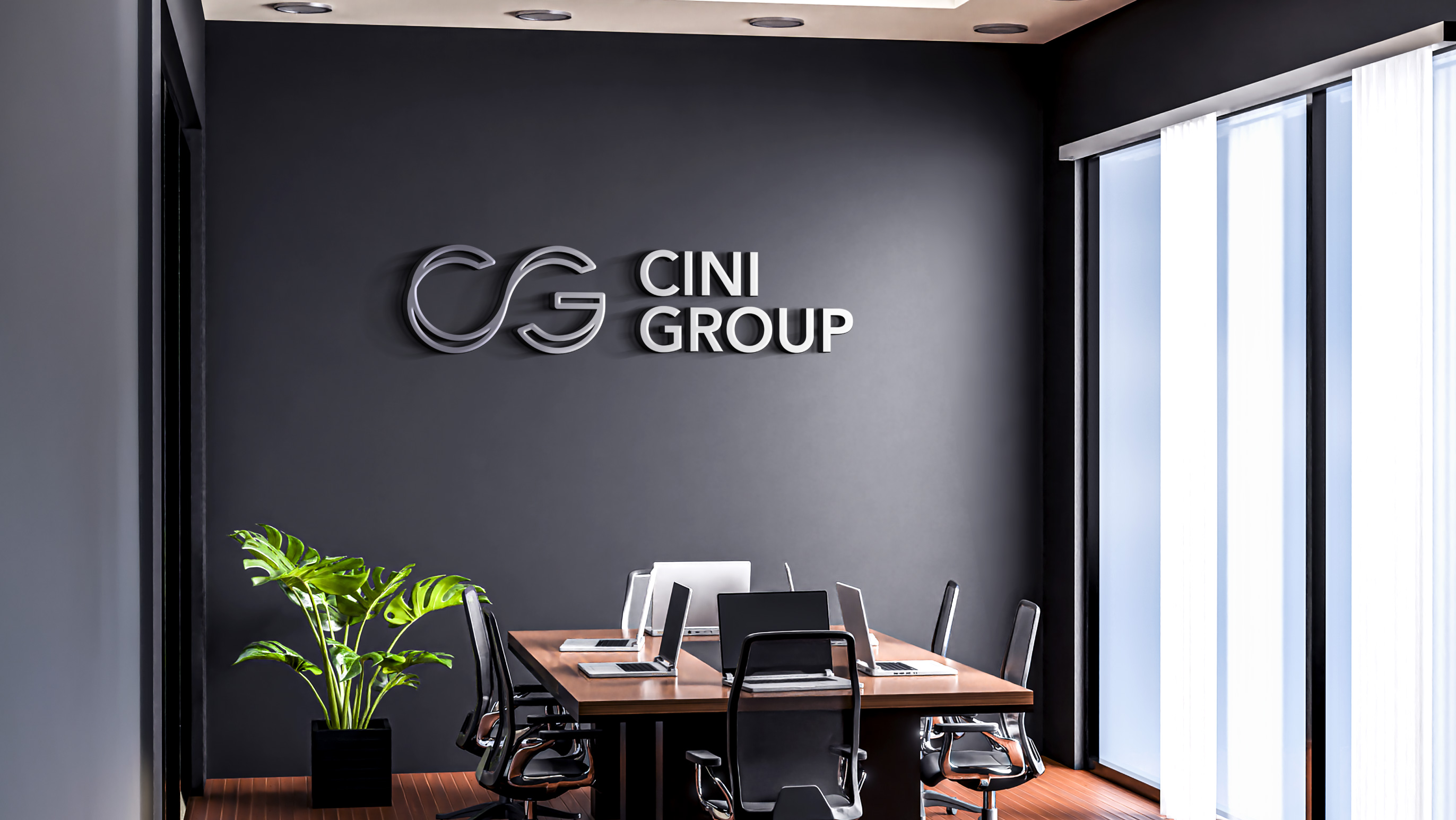
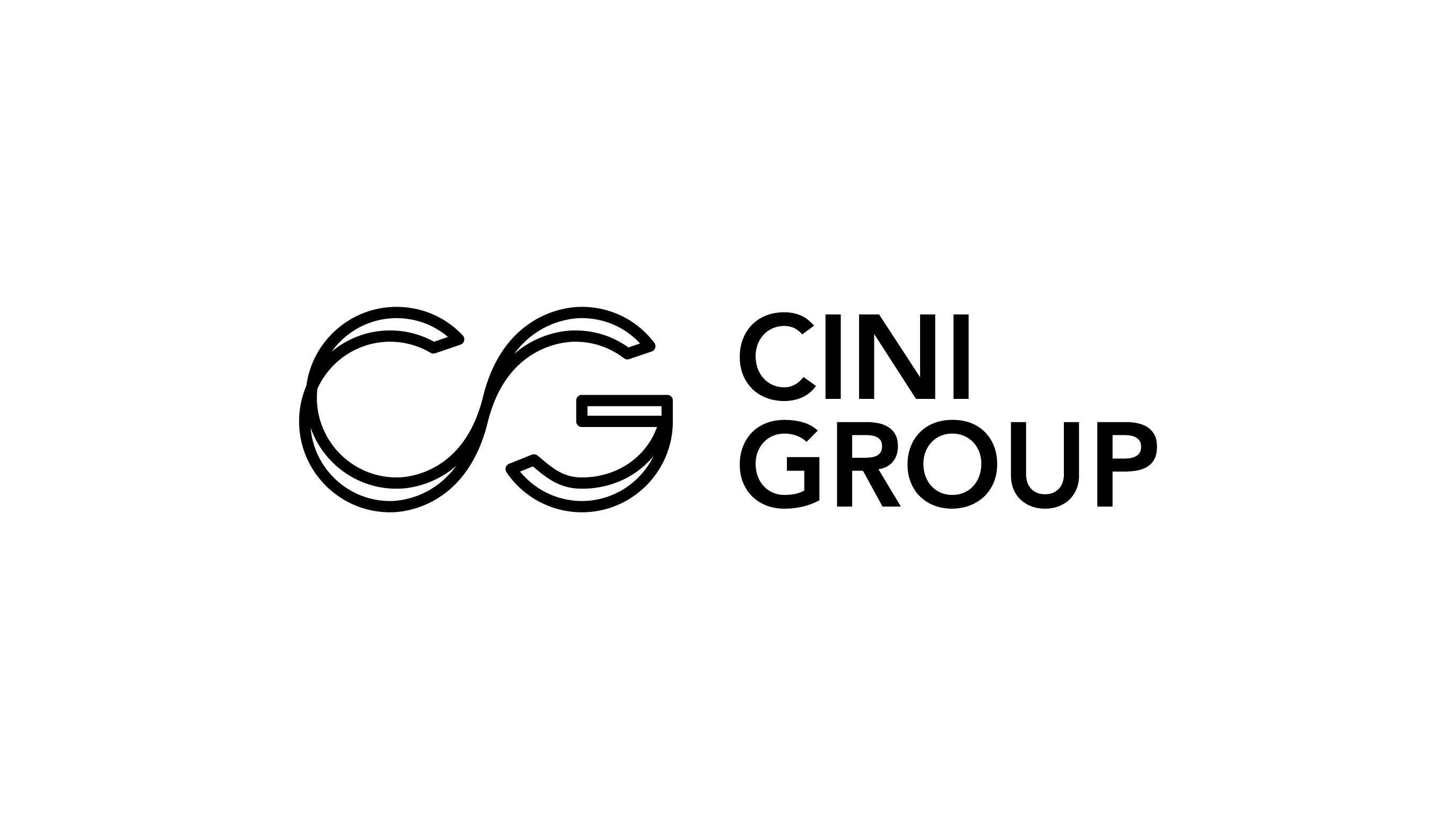
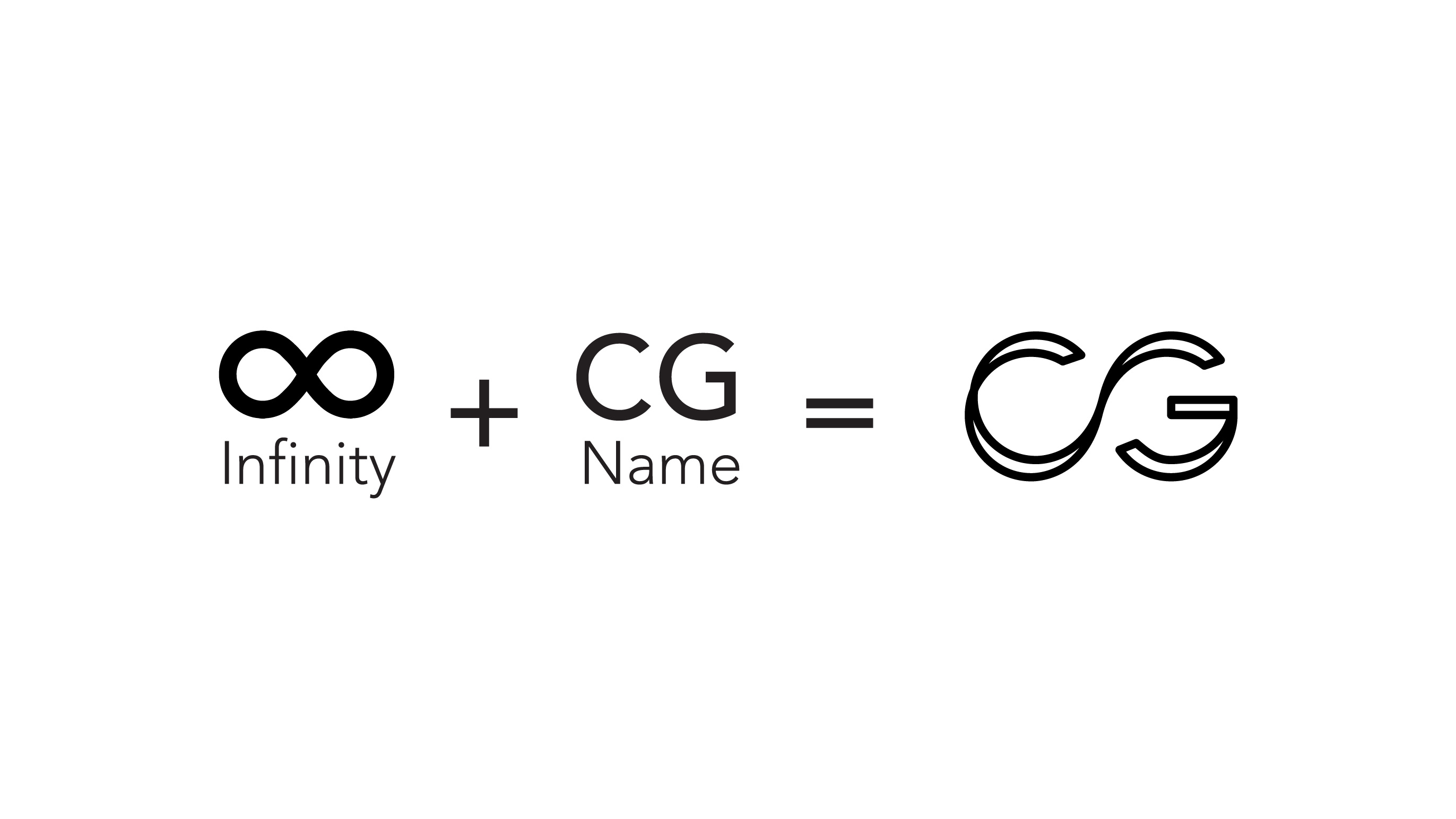
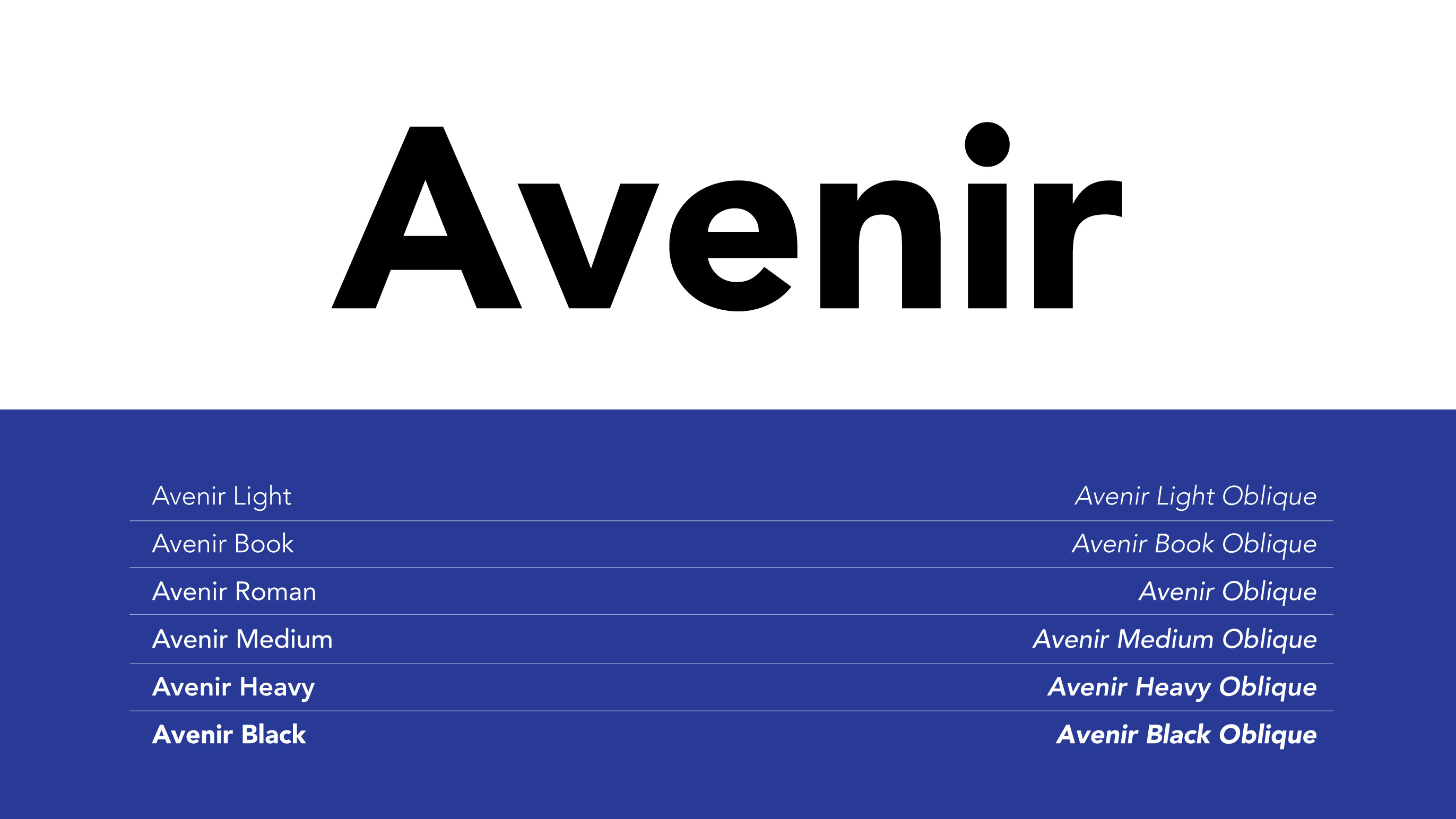
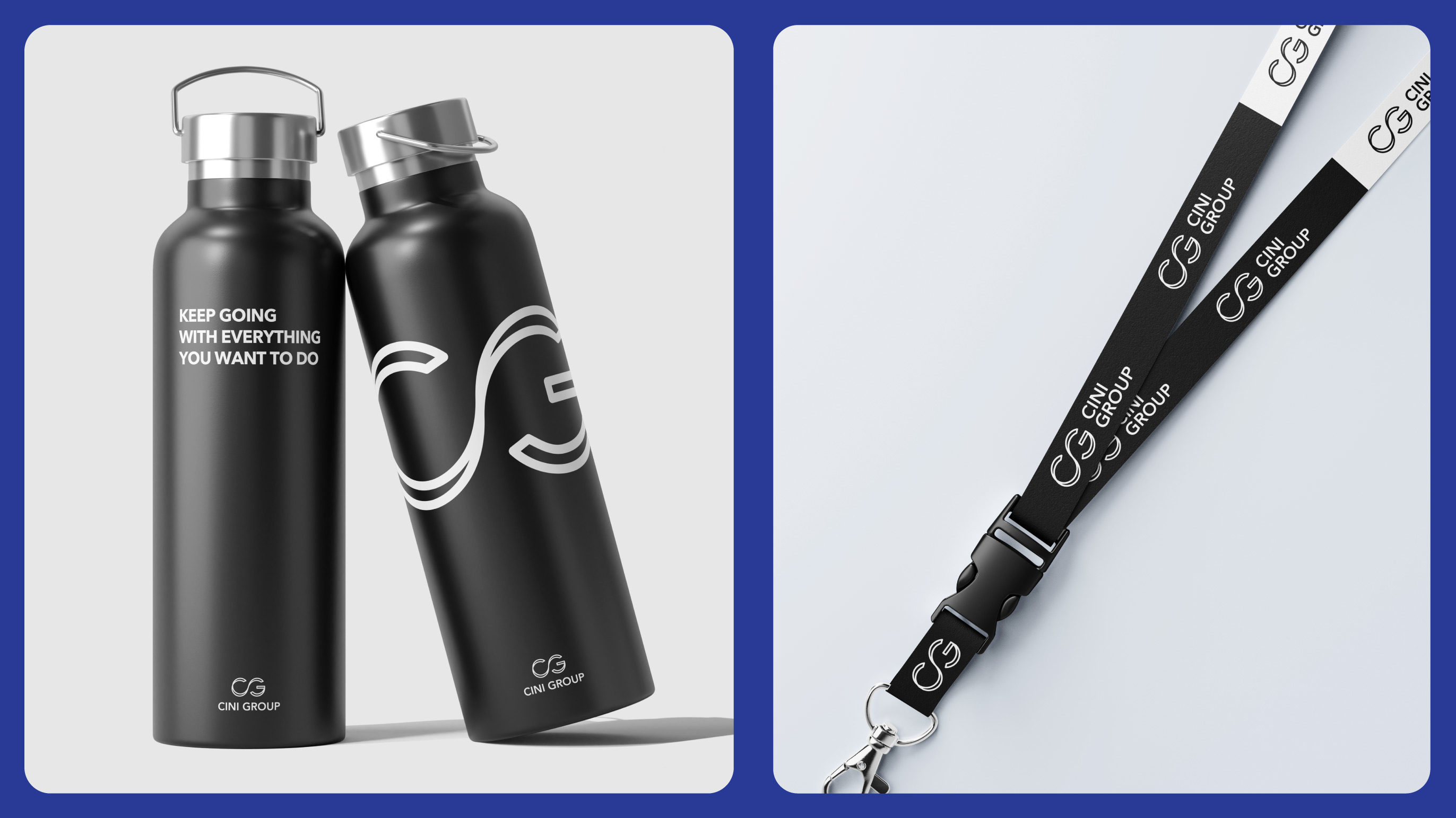
The central idea came from the merger itself: two entities becoming one, continuously connected to their market. The logo translates this directly, an infinity symbol reshaped into the initials CG, suggesting continuity, adaptability, and lasting relationships. Clean typography, a primary black and white palette, and navy blue as a supporting color keep the system professional without being cold.
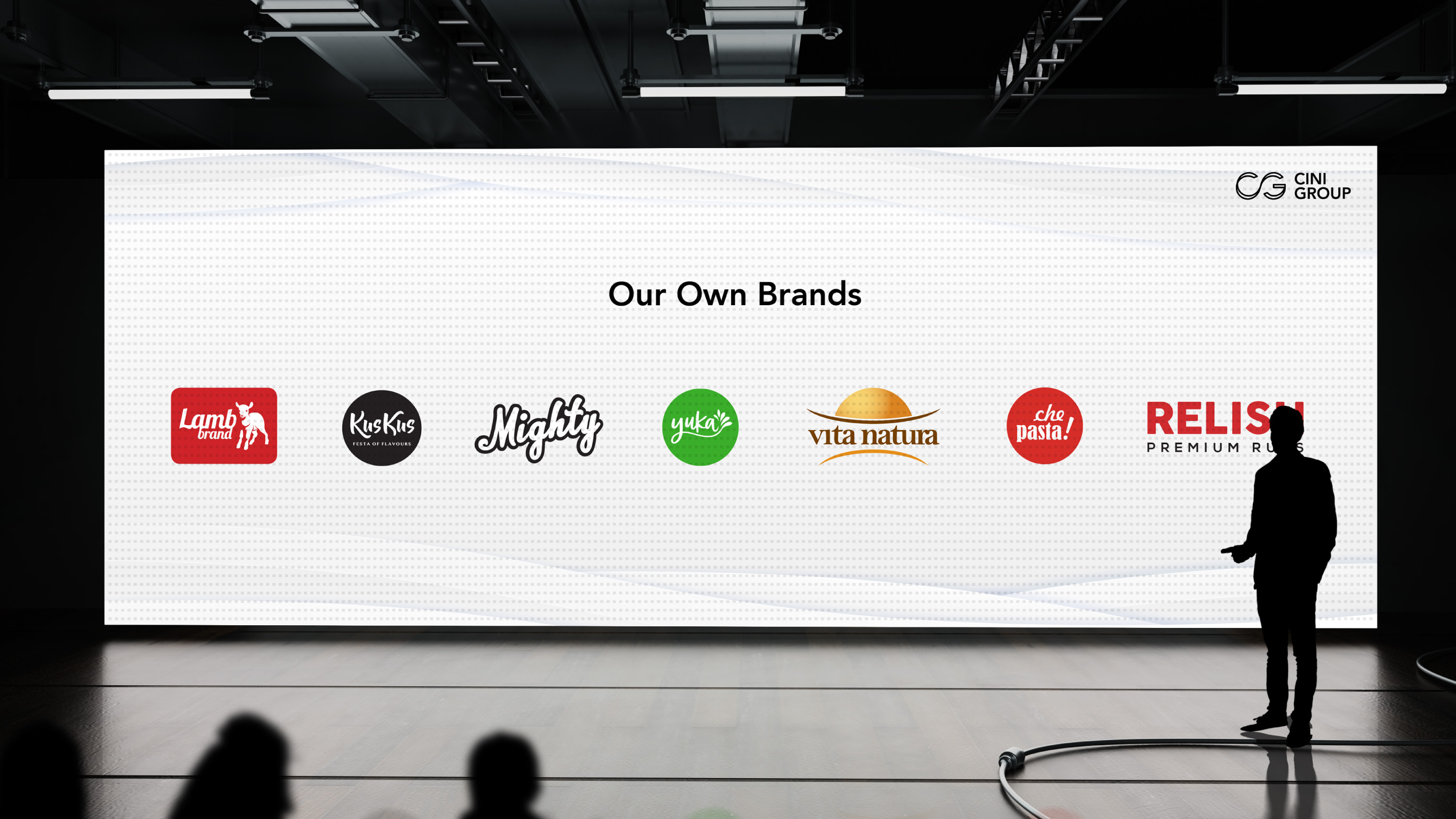
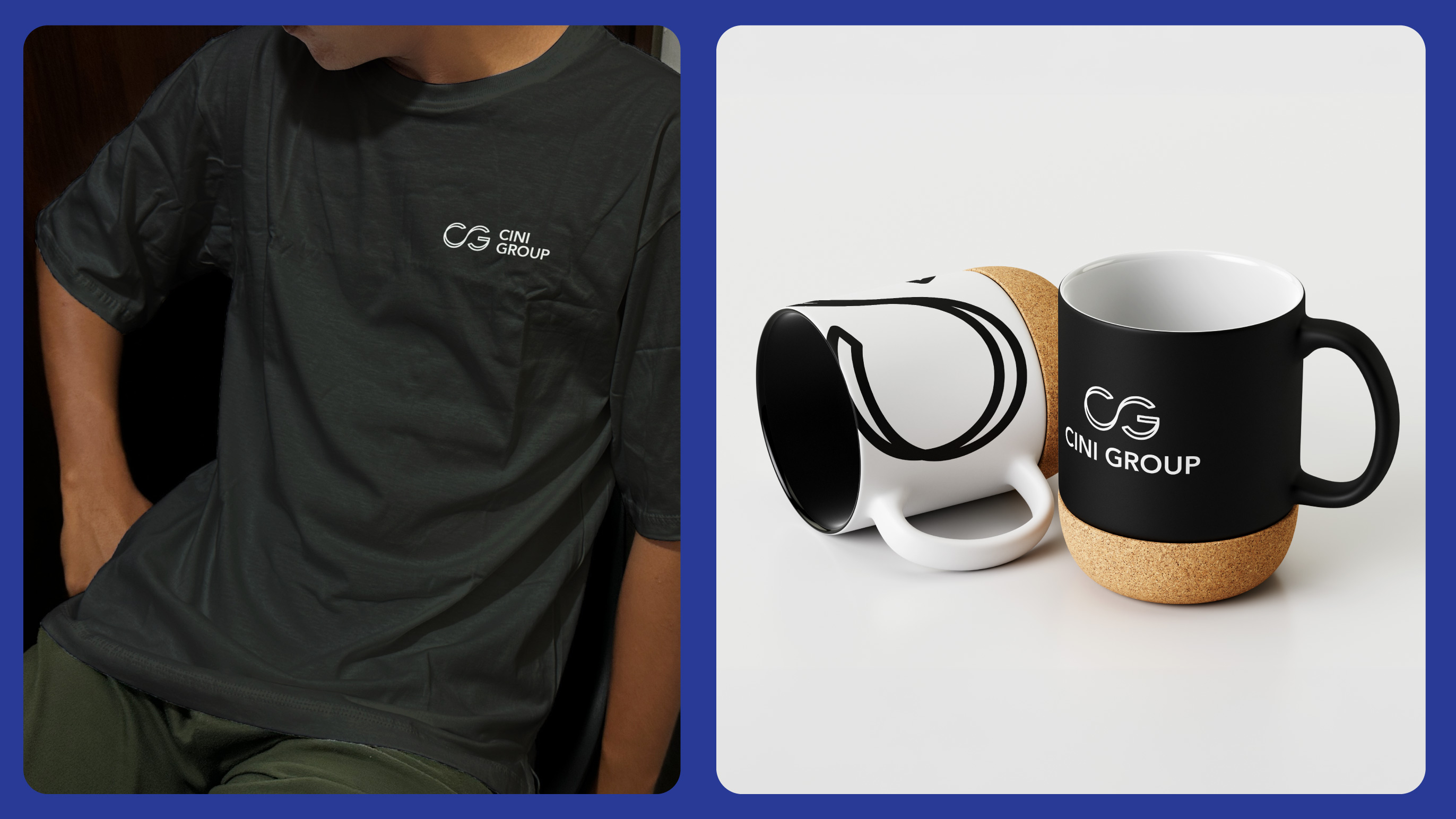
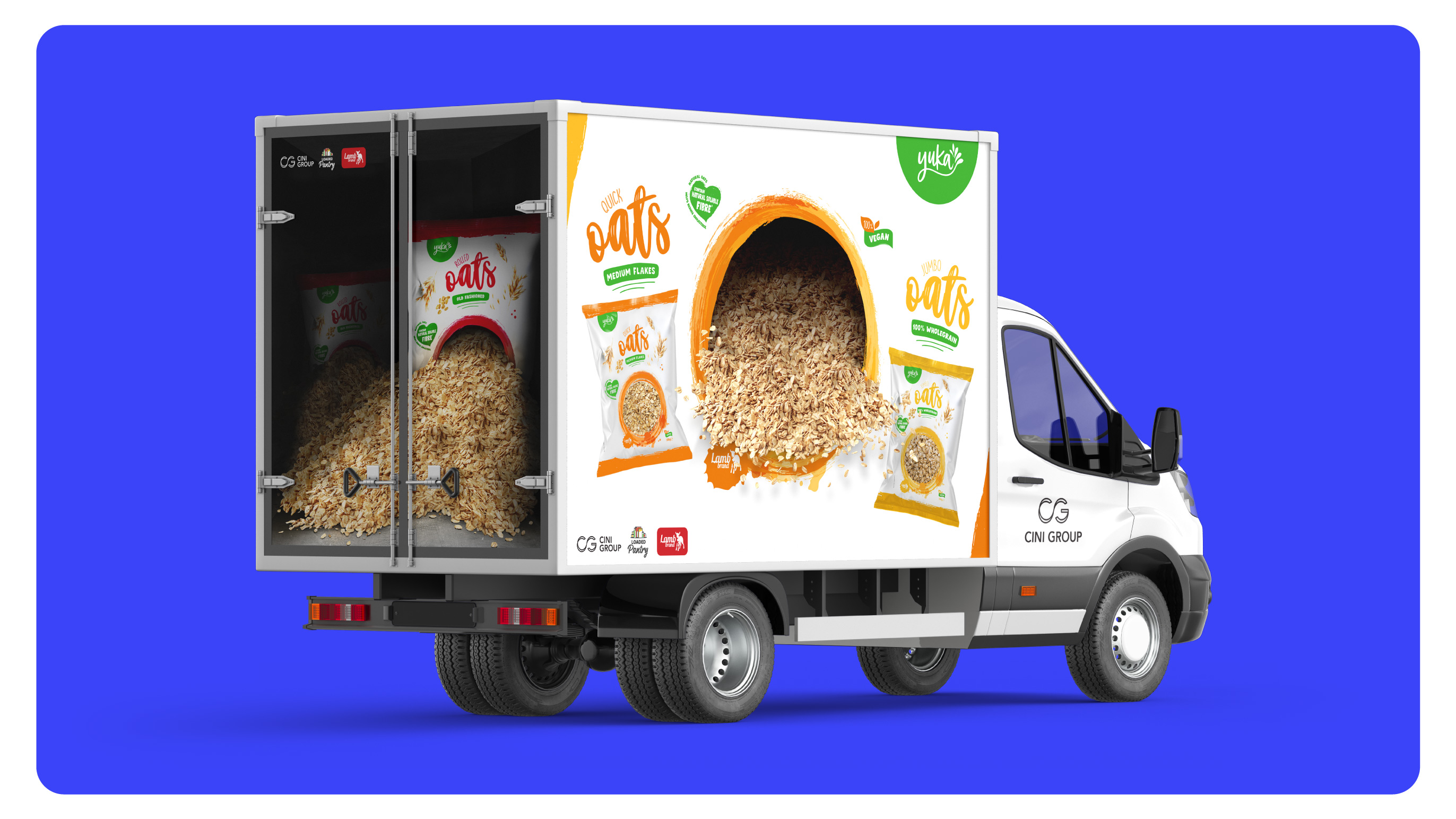
I was responsible for the full brand identity: concept, visual system, and implementation, ensuring consistency across every touchpoint, from business cards and packaging to delivery trucks, social media, and corporate event presentations.